
As I expected, now that the new year is in full swing, this week filled itself up with “stuff.” Details for various commitments I made last year. But I managed to carve out enough time to work on a painting. I was enchanted by a series of images someone posted of frozen soap bubbles. I made a copy of one of them to be the inspiration for this week’s painting. I’ve come to see the parallels in writing and painting: it all comes down to creative problem solving. How do I get the image in my mind onto the page? Or in this case, how do I take this photo apart into workable sections and to create a new image. Here is the photo that came from the blog post (by Greg Richards at Distractify.com)
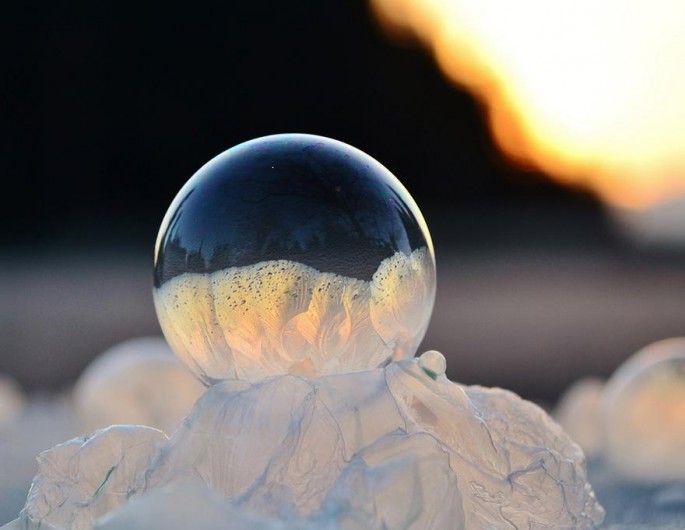
When I looked at this gorgeous bubble up close, I soon discovered that you can see an entire scene reflected in the bubble: buildings, snow, and a large tree. I decided to work on the bubble using colored pencil. Here’s how the first few days went:


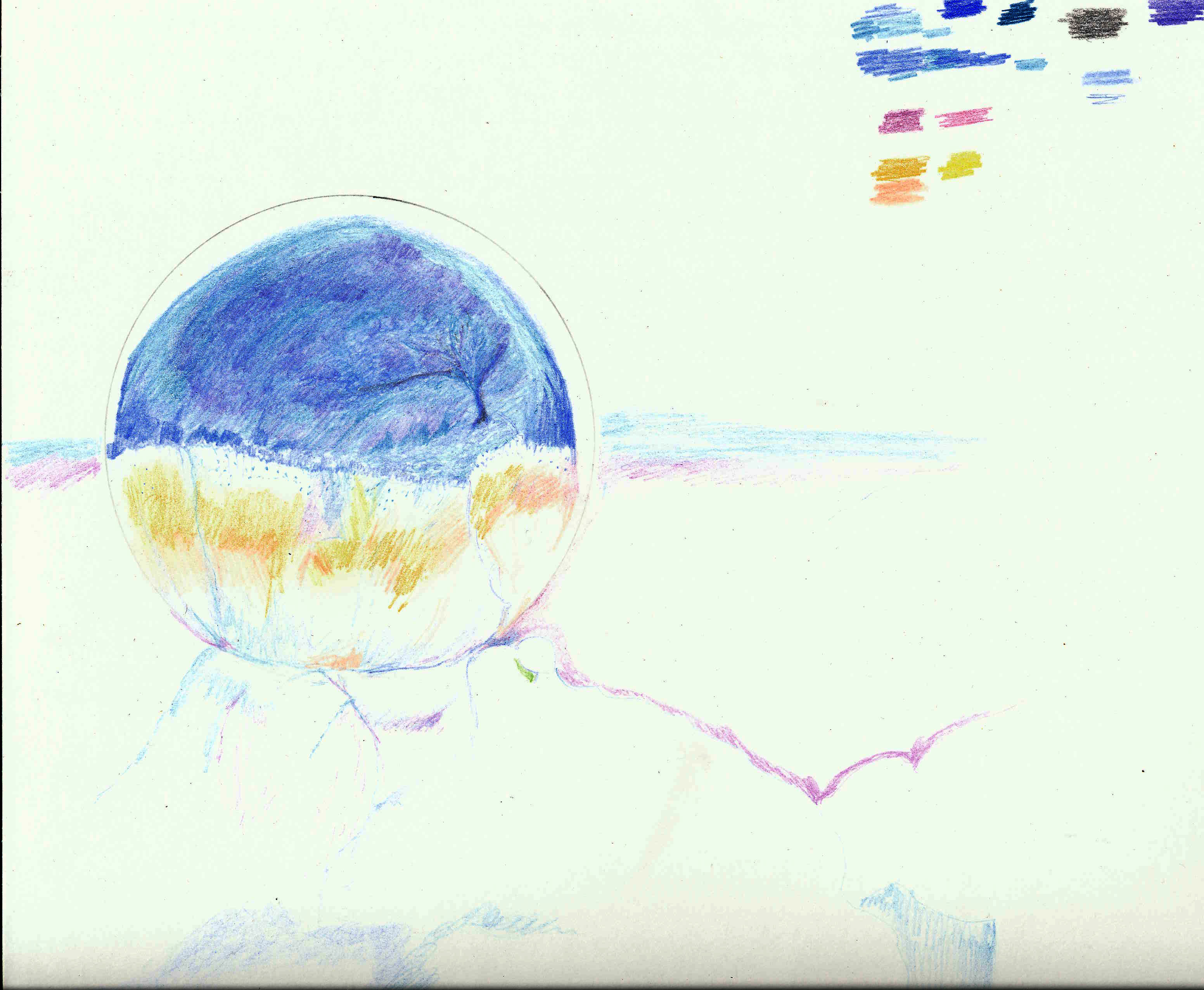
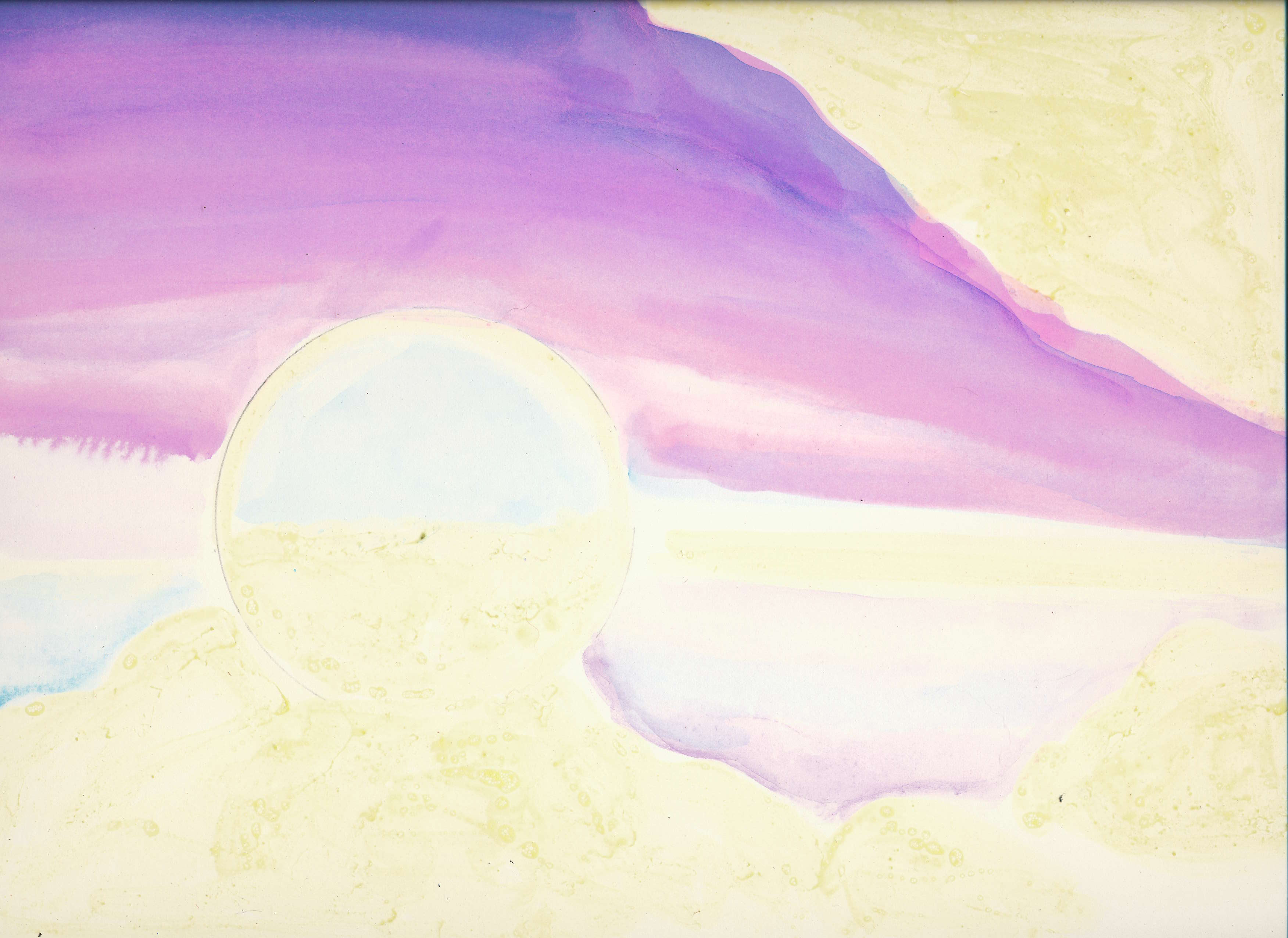
Now I tried I trick that I learned in art class, you can use turpentine to blend colored pencils. I gave that a try, with not so great results. You can see at the bottom where the color of the turpentine left a yellowish stain on the melted bubbles. So I stopped with that drawing and moved on to the final version. As a Christmas present I bought myself some Arches watercolor paper, hot pressed (that makes the paper very smooth) 140 lbs. weight. I used art masking fluid to preserve the parts of the paper that I wanted to stay white. That’s the yellow stuff. Here is the first set of colors:
I let all of that dry and added more:
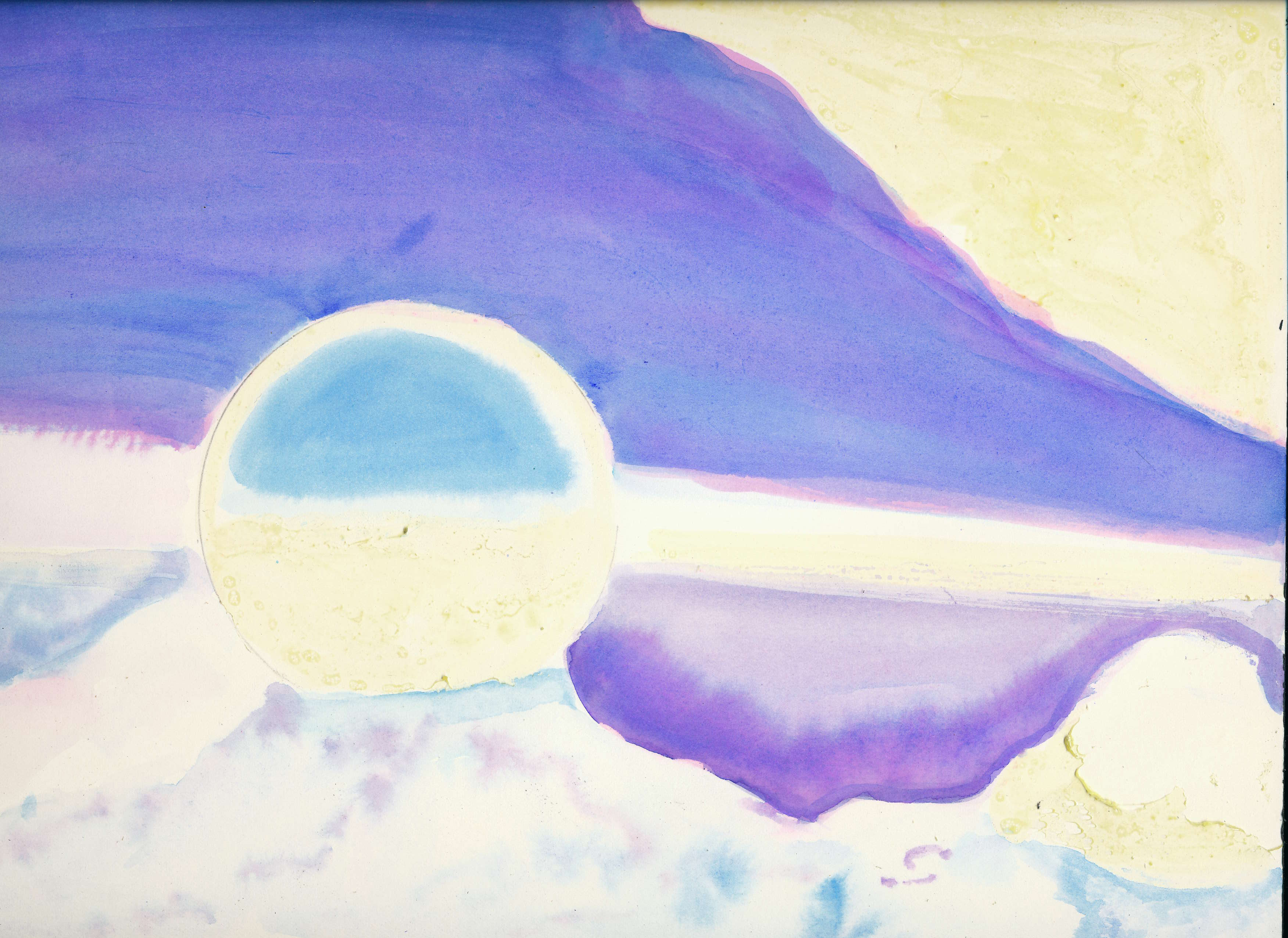
And as you can see, I am nowhere near being finished. But that has been one of the biggest lessons for me: YOU CAN’T RUSH ART. Every time I think it will just take a few minutes, I find I need more time. And I find I make mistakes and wonder how I am going to correct them. But that is the point of this series, to make mistakes and learn from them.
What do you think? Are you liking it so far? I’d love to hear your comments. I hope you have enjoyed what I’m trying to do, which is practice, practice, practice. You are welcome to use these images in your blogs, all I ask is that you credit them to Rachel Funk Heller and add a link to this site, rachelfunkheller.com Thanks for stopping by!